
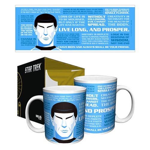
Celebrate Star Trek’s 50th Anniversary in perfectly refined style. This 50th Anniversary mug features the Spock from Ty Mattson’s 50th Anniversary Art piece “Spock”. Start every day with your coffee this way and you’re certain to be prepared for any adventures you encounter along your day’s mission.
This is a must have for Star Trek fans! The 11 oz. mug measures about 3 3/4-inches tall x 3 1/4-inches in diameter. Do not microwave. Hand wash only. Not dishwasher safe.
About the Artist
Ty Mattson is a design practitioner and founder and creative director of Mattson Creative, a Southern California-based graphic design studio specializing in creating visual language for such clients as Apple, Billabong, Cartoon Network, CBS, Coca-Cola, Discovery Channel, DreamWorks, Hasbro, Mattel, Nickelodeon, Showtime, Target, Universal and more.
Mattson’s work has appeared in numerous professional publications, among them HOW, LogoLounge and Print, and has been recognized for excellence by the several leading design competitions, including the One Show and Communication Arts. Mattson studied design at the University of Michigan at Ann Arbor.
He lives in Irvine, California.
In creating your artwork for the exhibition, what was your inspiration?
I went back to The Original Series. And back to my original memories of the series. To me, Spock is so iconic that I wanted to focus on him. I wanted to depict him using only two colors, with a very graphic, pop-art sensibility. Then to hear that Leonard Nimoy passed away while I was working on this piece, it became sort of a tribute to him and his work.
What is your favorite Star Trek series?
The Original Series stands out to me. My dad liked it and I remember watching it with him. There was something so unique about the way it looked – the coloration made a big impression on me.
How is your Star Trek artwork similar to or different from your other works?
I think it’s similar in that I’ve used a certain amount of reduction. Reduction of detail as well as a limited color palette to create visual impact. I also tend to gravitate towards strikingly straightforward depictions with little to no background – similar to how a child would draw a picture, but with some details that add sophistication.